
Redefining Fiber Cement Siding
How can we make cement board siding, now found everywhere, appear to be a more elegant and special product?
Redefining Fiber Cement Siding
We are constantly rethinking how we use materials. Buildings are composed of wood, glass, concrete, fiber cement board, plastics, composites, metals and many other materials today. We all have associations with materials from our own experiences. Materials can make a space feel warm or cold, light or dark, or tell us we’re in a home or a hospital. They are the background to our daily routines and memories. The same material can appear refined and elegant, or mundane and ubiquitous depending on how it’s used.
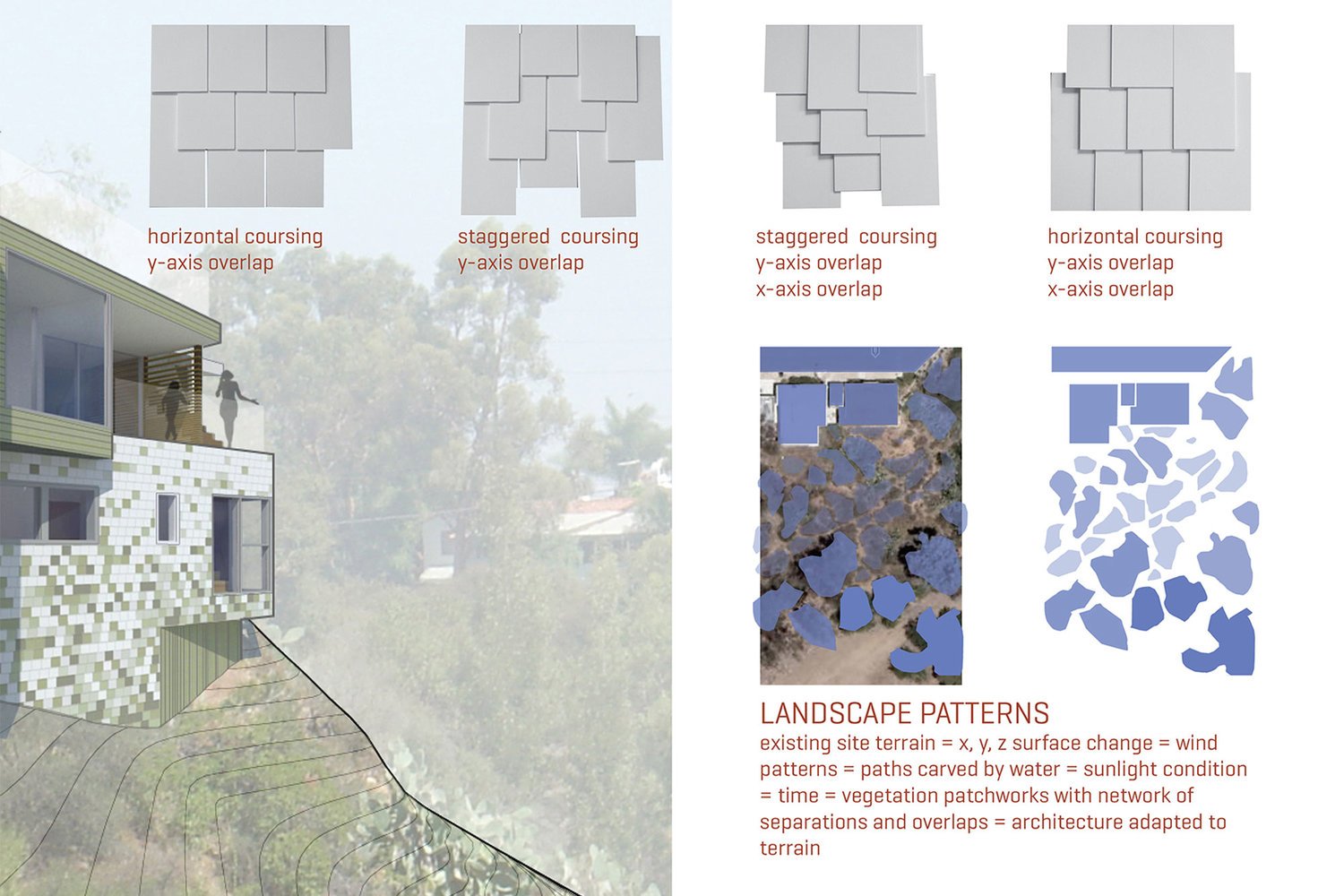
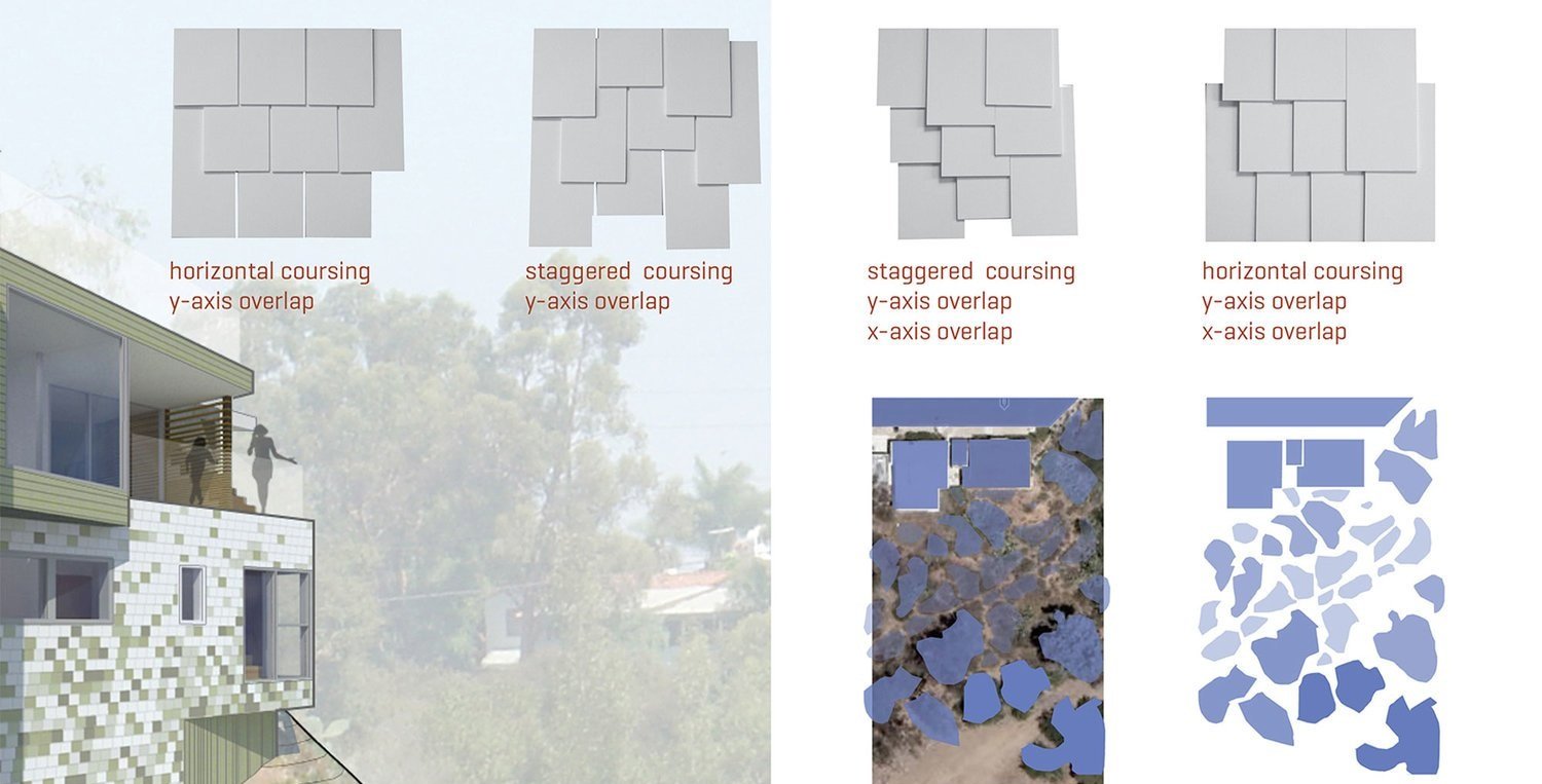
One such ubiquitous material is fiber cement board, now used on most residential and multifamily construction because of its very low cost, ease of installation, and low maintenance. There are many different manufactures such as Hardie, Nichiha, CBF Silbonit, but they all feel like paper mache and have the look of flat painted drywall.
PATTERNING: In the Canyon house project, we tested various patterning techniques to break down the standard size and find more appealing proportions and effects. We assimilated patterns to the surrounding landscape to visually blend the material, taking on a more organic appearance. A number of rules were developed in the patterning sequencing, and the addition of color reinforced the organic appearance on the hillside.
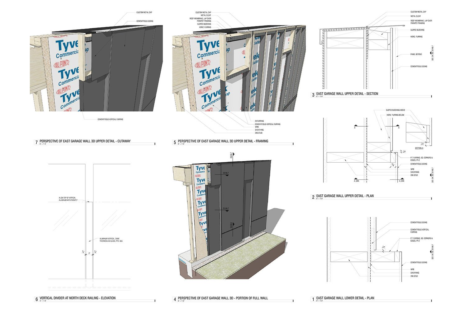
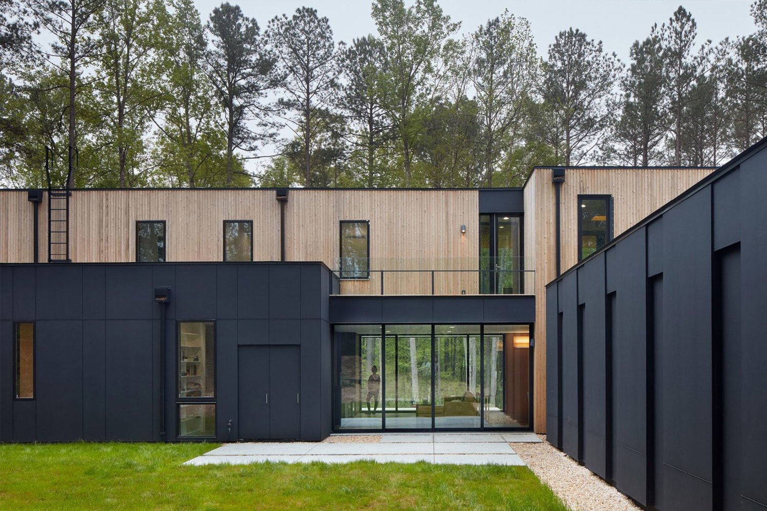
STEPPING: In the Balakrishnan project we became more interested in creating visual depth in the material. We tested various ways to offset wood furring behind the fiber cement board for a more elegant effect. Accent landscape lighting can be inserted between panels to accentuate and give function to what otherwise is a blank wall. Careful detailing and execution is critical to the final product.
Re-presenting materials like fiber cement board in ways we don’t typically associate them elevates their appearance and function, while still having the low cost benefits.
More Projects

How can we increase rentable square footage and building efficiency by eliminating redundancy in standard building egress?
On several of our feasibility studies for multifamily housing, we have employed an interlocking stair system to increase rentable square footage. Typically, two separate egress stairs are constructed in a multifamily building. By simplifying this and constructing two stairs in the same footprint, we can increase the rentable or sellable square footage and increase the building’s efficiency. In Massachusetts, the building code allows an Interlocking stair to act as two separate means of egress as long the building is not a high rise and the fire rating is maintained between the two stairs. The entry doors to the stair must also be separated by 1/3 the overall diagonal of the building, assuming the building is protected with automatic sprinklers (2015 IBC: 1107.1.1)
This system is often used in New York City on very tight infill sites for high rise construction. New York City building code is more generous in allowing the use of an interlocking stair. They are permitted in high rise construction of R-2 occupancies as long as the shaft and separation are constructed of 2 hour rated masonry, and the entry doors are separated by 15’ minimum (NYCBC 1015.2.1).
In terms of cost, from our experience in the Boston area a conventional stair costs approximately $400-500/ tread, while an interlocking stair costs approximately $350-$450/ tread. Landings for both systems cost approximately $1,000 dollars, and for an interlocking stair system, there are less landings. There is some extra cost in the interlocking stair for a 2 hour rated shaft wall separating the stairs. However, if steel and concrete construction is used and the landings are cantilevered, this could help to reduce the cost of a custom stair landing. We believe the cost of two typical switchback stairs versus one interlocking stair would be closely priced depending on the construction methods. Therefore, for a very similar construction cost, we can gain valuable square footage that can be rented or sold, increasing revenue and profit.
C O L L A B O R A T O R S
Hastings Consulting

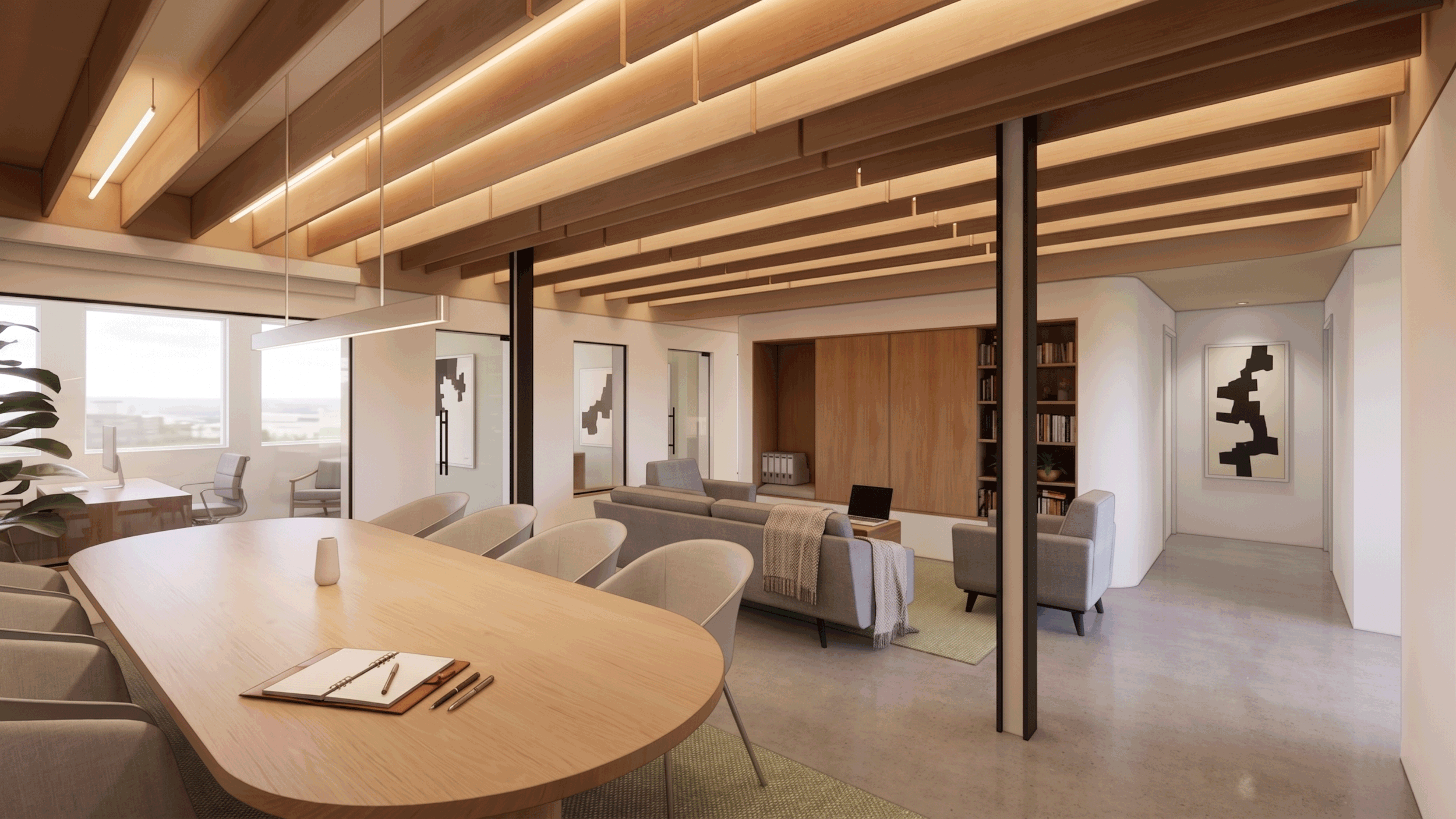
H-Co Properties approached us with a list of desired outcomes for their office renovation: enhance workflow function and efficiency, create community, define a cohesive brand identity, and represent professionalism. They are a growing group of on-the-move brokers with clientele in both single and multifamily markets.
Our approach created a flexible semi-open office layout with distinct support and work areas. The materials used are uniquely assembled, but warm and familiar to residential clientele. A custom wood fin ceiling unifies the workspace, baffles light and sound, and gives a visual identity to the office. Sustainable strategies and locally sourced materials were used. The kitchenette holds employee mail and a copy area to enhance community interactions in a centralized gathering spot. Flexibility for individual working styles are taken into account in formal seated desks, standing desks, informal soft seating, and the kitchen island. Smaller details such as color, texture, and consistent assembly techniques are used to create visual unity in every inch of this small office.
C O L L A B O R A T OR S
Optima Engineering | AG Builders | Keith Isaacs Photography | Jonathan Davis Lighting / Glass

How can we efficiently create a custom metal exterior on a tight budget?
The exterior of the Taylor-Metcalf Residence in San Diego is clad in a weathered steel skin with unique patterns and perforations. By customizing the cladding for the home, ThoughtCraft needed to rethink the typical delivery process and coordinate its execution. To keep the costs down, fabrication of the panels was streamlined by utilizing both analog and automation processes. This allowed for efficient collaboration with hands-on clients Joe Metcalf and Traci Taylor, simplified cutting of steel sheets by Waterjet West, and straightforward installation by Brian Vincent of Vincent Design and K-Co.
The façade has 212 metal panels, many of which are unique due to the shape of the existing home and the custom perforation patterns. This made it imperative to streamline the production of the panels to save on labor costs and to keep from cutting each panel individually by hand. Once the field verifications of the wood framing were gathered, ThoughtCraft produced a layout drawing depicting all of the panels on the façade, and coded these panels so they could be easily tagged and identified in the field. Field cut pieces were strategically located and oversized so they could be trimmed later to adjust to any imperfections in the framing. These layouts were then imported into a nesting automation software to pack them as tight as possible on the 5x10 steel sheets. The result was over 90% efficiency in material use. The files exported from the nesting software allowed for the solid panels to be easily cut to profile on a shear, and the perforated panels were produced with a waterjet machine. ThoughtCraft’s involvement helped save on material cost and reduction of material waste, therefore allowing for a beautiful custom weathered steel skin on a tight budget.
C O L L A B O R A T OR S
Ian Mellor | Vincent Designs, Inc. | Studio 512 | K-Co | Waterjet West, Inc. | Arise Design

How can a café embody the innovative and community spirit of its brand?
Designed as its first brick and mortar location, Third Cliff bakery anchors and activates the corner of a new mixed-use development at a busy corner along Washington Street in the Jamaica Plain neighborhood of Boston. Inside, a warm and light filled space is carefully articulated with birch plywood millwork to form the heart of the café. With limited space, the heart organizes the cafe into three distinct seating zones for individuals or smalls groups. This central hub is engaged by employees and customers alike fostering an open sense of community where one of many innovative baked goods can be enjoyed.
C O L L A B O R A T O R S
Wylie Design+Build

How can we make cement board siding, now found everywhere, appear to be a more elegant and special product?
We are constantly rethinking how we use materials. Buildings are composed of wood, glass, concrete, fiber cement board, plastics, composites, metals and many other materials today. We all have associations with materials from our own experiences. Materials can make a space feel warm or cold, light or dark, or tell us we’re in a home or a hospital. They are the background to our daily routines and memories. The same material can appear refined and elegant, or mundane and ubiquitous depending on how it’s used.
One such ubiquitous material is fiber cement board, now used on most residential and multifamily construction because of its very low cost, ease of installation, and low maintenance. There are many different manufactures such as Hardie, Nichiha, CBF Silbonit, but they all feel like paper mache and have the look of flat painted drywall.
PATTERNING: In the Canyon house project, we tested various patterning techniques to break down the standard size and find more appealing proportions and effects. We assimilated patterns to the surrounding landscape to visually blend the material, taking on a more organic appearance. A number of rules were developed in the patterning sequencing, and the addition of color reinforced the organic appearance on the hillside.
STEPPING: In the Balakrishnan project we became more interested in creating visual depth in the material. We tested various ways to offset wood furring behind the fiber cement board for a more elegant effect. Accent landscape lighting can be inserted between panels to accentuate and give function to what otherwise is a blank wall. Careful detailing and execution is critical to the final product.
Re-presenting materials like fiber cement board in ways we don’t typically associate them elevates their appearance and function, while still having the low cost benefits.

How can a brick-and-mortar restaurant emphasize a brand identity?
The concept for Fresh Food Generation’s first brick and mortar space was developed around two driving ideas: garden and graffiti. Reminiscent of the brands emphasis on locally sourced food, the “garden” evokes a connection to nature while the “graffiti” was inspired by the local urban art scene and the owners desire to create a sense of community in a diverse neighborhood. Niches carved into the black stained plywood intervention and a live plant wall layer a rich natural garden aesthetic into the space. A hand painted urban graffiti wall greets customers upon entering the restaurant. These two elements combine to reinforce the essence of the delicious culinary experience rooted in farm to plate ingredients and the street vibe of their food truck origin.
C O L L A B O R A T O R S
One Way Development | TJM Consulting | Deme5

How do we create urban furniture with a collective identity while maximizing flexibility for arrangements and vendors?
As citizens work to take back their urban communities, planning departments have been playing catch- up. Shopping kiosks, parklets, push carts, food trucks, guerilla gardening, yarn bombing, and all manner of tactical urbanism have begun to proliferate urban centers. While often welcomed, this proliferation has begun to breakdown the visual coherence of city districts, edges, nodes and other elements that define identity. In response, planning departments have started embracing tactical urbanism as an instigator for renewing street life as well as attempting to write some rules to retain identity and strengthen what Kevin Lynch termed in 1960 as “The Image of the City.”
In 2011 CUBE was approached by the lease holder of a fruit and flower stand located at the prominent corner of the Old South Meeting House (a National Landmark). We were asked to design a semi- permanent structure that addressed security issues for the market as well as respected the historic nature of the building it sits aside. This led to a larger study of the many such vendors in Boston’s Downtown Crossing district, and invited conversations with the Boston Redevelopment Authority which had been struggling with the loss of a cohesive identity in the district. After speaking with the many food and retail vendor cart owners in the area, we begin to define a modular and moveable kiosk that both held identity in its form and graphics for the city, and allowed vendors to customize and graft onto for their own needs. The kiosks could be presented individually or linked in many configurations to form a full market.
One such ubiquitous material is fiber cement board, now used on most residential and multifamily construction because of its very low cost, ease of installation, and low maintenance. There are many different manufactures such as Hardie, Nichiha, CBF Silbonit, but they all feel like paper mache and have the look of flat painted drywall.
PATTERNING: In the Canyon house project, we tested various patterning techniques to break down the standard size and find more appealing proportions and effects. We assimilated patterns to the surrounding landscape to visually blend the material, taking on a more organic appearance. A number of rules were developed in the patterning sequencing, and the addition of color reinforced the organic appearance on the hillside.
STEPPING: In the Balakrishnan project we became more interested in creating visual depth in the material. We tested various ways to offset wood furring behind the fiber cement board for a more elegant effect. Accent landscape lighting can be inserted between panels to accentuate and give function to what otherwise is a blank wall. Careful detailing and execution is critical to the final product.
Re-presenting materials like fiber cement board in ways we don’t typically associate them elevates their appearance and function, while still having the low cost benefits.

How can we enhance the interactions between office and production personnel to improve the company culture?
The new headquarters for an innovative water-based screen printing company requires a workspace that improves interaction between office and production personnel while also establishing a multi-functional showroom. By proposing a series of insertions into an underutilized warehouse, this project simplifies the complex workflow of overlapping tasks as an open collaborative environment. Forming the edge of Orlando’s new Creative Village, the bold façade facelift creates a branding presence that engages clients and visitors along the interstate highway and at street level. A new entry porch provides accessibility to the renovated interior leading to an educational experience revealing the process of printing.
H I G H L I G H T S
• Adaptive reuse of a vacant warehouse

In 2007, a demolition permit had been granted for Paul Rudolph’s 1960 Blue Cross Blue Shield office building to make way for New England’s tallest tower by Renzo Piano. Intrigued by the collision of new and old, and the lack of demolition alternatives, we set out to rethink the meaning of preservation using this project as an example.
The legacy of Rudolph’s building lies mainly in its innovative facade that contains the mechanical and structural systems, thereby freeing the interior floor space for office use. Drawing from the work of artist Gordon Matta-Clark, we hypothesized a series of concepts that reinterpreted preservation as: integration, anatomical exhibition, dissection, public art and remnant. In doing so, we revealed aspects of the building that prompted a new understanding of its cultural contributions, and began a new dialogue about how architecture should be preserved. These explorations led us to new projects and speaking engagements, as well as a successful stay of demolition for Rudolph’s building.

How can we define a differentiating identity for an aging office building?
The client’s primary goal in repositioning this low-grade office building was to achieve greater exposure and presence for its ideal commercial location along a major thoroughfare. We elevated the market status of the property by re-designing the parking and procession to a new lobby and canopy serving as a visual landmark and creating a strong identity for the building. The new facade and face-lift reveals the interior through a large transparent glazed wall framed by the folding canopy. Exterior surfaces overlap and appear indoors to blur the boundary between inside and out. Visitors are greeted within the space furthermore by modulated materials, reveals, colors and rhythmic lighting.
H I G H L I G H T S
• Elevated market status with cost-effective design
• Rainscreen facade
C O L L A B O R A T O R S
SGH Structural Engineers | CSI Engineering | Erland Construction

How can a café embody the values of one of the most prominent fair-trade brands?
The well-known Equal Exchange brand builds long-term fair trade partnerships that are economically just and environmentally sound, to foster mutually beneficial relationships between farmers and consumers.
Our facelift to their thriving upbeat café near North Station in Boston was a collaboration between the café staff, branding team and ThoughtCraft to get the most bang for their buck. In addition to designing the fit-out, we administered the entire construction effort and managed all of the subcontractors and fabricators. Thanks to the Equal Exchange Café team for giving us the opportunity to freshen up one of only two of their product showcasing cafés worldwide!
C O L L A B O R A T O R S
Matt Delphenich Photography

How can a small sales office offer an interactive client experience?
Insertion of a ground floor retail use into a newly renovated historically significant mixed-use building. New physical and digital interactive displays allow a unique home buying experience.
H I G H L I G H T S
• Built within the award-winning Hayden Building, LEED Homes Platinum
•Relocation and reuse of tower unit mock-up kitchen, bath and other components
C O L L A B O R A T O R S
CSI Engineering | Marc Truant & Associates | John Horner Photography

How do we activate one of Boston’s busiest street corners while preserving the integrity of one of America’s most preeminent landmarks?
Since the 1773 mass protest meetings that led to the Boston Tea Party, Old South Meeting House has served as a gathering place for discussion and celebration and a haven for free speech.
The museum has rented the street corner to various market stands over the years as a source of income. The new market enclosure will bring a new sense of transparency to the corner of this historic building and better activate this pedestrian center in the downtown crossing district. The structure is designed to be free standing with no attachment to the historic building. For the market vendor it will provide a new security enclosure and better visibility and interior organization.

How do we create urban furniture with a collective identity while maximizing flexibility for arrangements and vendors?
Too often preservation is a curatorial act focused solely on the physical building and not the ideas and stories that shaped it over time. New architecture can have a dialogue with old architecture to evoke story, memory, and solidify identity and meaning. Doing so reveals deeper meanings and heightens awareness of history. This approach can be realized in five key phases:
1. TRACING TIME: Move beyond the physical building to uncover the ideas, stories, and events that first brought it about. This approach can move buildings beyond it’s “a good example of…” to it’s “directly connected too the story of…”
2. UNCOVERING THEMES: By mapping overlapping historic influences such as the construction methods, the occupants, the architect, the neighborhood, the economy, the cultural influences, and the news of the day, we can compare and uncover the unique threads and themes.
3. STRATEGIZING APPROACH: Based on historic significance, regulations, and project goals, define the intent: should the building be fully preserved, an archeologically interpreted site, partially preserved, transformed, minimally preserved, or some hybrid approach?
4. CONCEPTUALIZING DESIGN: The rehabilitation, renovation, alterations, or additions are born out of the findings such that they help to activate and heighten the awareness of the building’s overlapping historic influences.
5. CRAFTING THE DETAILS: Careful detailing between old and new elements can heighten awareness, and integrated graphics can support the story.

How can we shape a building with light and water to create a vibrant social experience?
On a limited bay front site, the Garty Family Rowing Pavilion was designed to honor the competitive history and celebrate the future of the San Diego Rowing Club. The pavilion contains a century’s worth of artifacts and acts as an event space for parties and other social events. The building references the old craft of boat-building and the sleek lines of contemporary rowing shells. Defining the main event space, the elongated hull-shaped ceiling is held away from the walls to reveal the sky, exhaust heat through operable skylights and allow daylight to penetrate the space.
Chris Johns served as the Project Designer and Manager while working for ARCHITECTS hanna Gabriel wells.
H I G H L I G H T S
• AIA San Diego Design Award | Citation
• San Diego Architectural Foundation | Orchid Award

The design of this speculative development responds to the context of a vibrant downtown neighborhood with a high-rise building that nestles into the large infill lot with a strong presence.
Our charge was to design a building that complied with allowable zoning regulations and maximized value for the site. We explored a mix of various uses that would combine to shape the building’s form, activate the street and result in a dynamic structure that would recall the past with a contemporary sense of permanence. The building design responds to the context with significant retail and commercial opportunities on the first two levels which are pulled in from the property line to create a double height arcade along the street. The remaining upper levels of the building provide a boutique hotel with a sky-lobby, indoor amenity spaces, and various outdoor terraces. The modularity of the façade expresses the cellular nature of the stacked hotel rooms and is carried out down to the articulation of bricks.
H I G H L I G H T S
• Thin composite steel-concrete floor system to achieve shallow floor-to-floor heights.

How can heavy metal become visually light and airy?
This retail center just west of downtown had not been renovated since it was constructed in the 1970s. New ownership desired a fresh public appeal for both potential tenants and customers.
As a budget conscious project, we choose to make necessary repairs and focus the majority of funds on adding a new metal marquee along the front. Our challenge was to create a fresh, light and airy feel. We did this through the interplay of perforated metal and light. The existing facade is painted as a backdrop with new perforated metal panels positioned in front. Different hole sizes are used for the perforation to vary the opacity. This allows sunlight through and the ability to see sky, trees, and layers behind - all are carefully detailed and choreographed. Custom steel frames bound each four foot panel and are hung off the building with structural steel. The ability to see through the perforated metal creates a fresh, light and airy feel to the plaza while providing a unique identity and branding opportunity.
H I G H L I G H T S
• Perforated metal panels, steel structure, and phenolic resin slats
C O L L A B O R A T O R S
Lynch Mykins | Engineered Designs | Wilson Covington Construction | Design Element Signs

How do we design a flexible urban space that encourages community participation?
Kendall Square has become as mecca for companies making tremendous advancements in technology and science but the recent commercial development has followed the status quo. This project proposes to play a unique role of enlivening a dead zone in the urban fabric by establishing an adaptable urban event space and an adaptable light filter to create opportunities day and night for organized events or low-key spontaneous gatherings. It is formed by two parts that establish its identity in the urban fabric. The ground level adaptable urban event space is defined by large bi-fold and swing doors that allow the Adapter to fully open up providing for a multitude of programmatic options. The upper section is an adaptable light filter made up of periscopes to choreograph the seasonal southern daylight, project light and graphics at night, and provide unique views into and out of the Adapter. The space is a brand, it stimulates interactive experiences and encourage users to observe space, light and material in unanticipated ways through its extreme adaptability.
H I G H L I G H T S
• Adaptive reuse of an underutilized MBTA utility space
• Flexible furniture components such as stages, bleachers, service counters, bike rack bartops, and display shelves adapt to various programmatic uses.
• Use of bi-fold hanger type doors.

How do we create a brand culture centered on people, food, and place?
This was the vision presented by the Steel String Brewery founders for their new production facility at Pluck Farm. After operating since 2011 in a small storefront in downtown Carrboro, the founders were ready to scale up production and expand their community on a 70-acre farm tract 15-minutes down the road. Our team began with a phased masterplan vision for the property, followed by a deep dive into the production facility for phase one. Steel String is hyper-local, centered around growing a portion of their ingredients for a truly farm-to-brew experience. Over time, this property will grow with the community offering a series of outdoor activities, events, and educational opportunities.
The production facility is the heart of the operations. Its placement on the land sets up future uses at the macro scale, while simple recessed porches organize outside gathering spaces and pathways at the micro scale. The brewery is constructed using a classic metal building for economy of scale. A separate pavilion bookends a seating and activities courtyard in between and organizes food truck parking. This 7,000 sf facility had to meet the many requirements for beer production, storage, shipping, and management. Inside the use of skylights and clerestory windows allows natural daylight throughout, reducing energy costs and making for a pleasant space to work.
C O L L A B O R A T O R S
CHADCO BuildersH I G H L I G H T S
• Elevated market status with cost-effective design
• Rainscreen facade
C O L L A B O R A T O R S
SGH Structural Engineers | CSI Engineering | Erland Construction

How do we design a flexible kiosk that thrives in both summer and winter?
In contrast to the typical kiosk, we sought to create an architecture that is light and transparent. Located on the heavily trafficked North Avenue beach in downtown Chicago, the identity of the kiosk is twofold: an expression of the elements of architecture and the vendor who inhabits it. The transparent skin blends with its context like a chameleon, as well as showcasing the vendor. Two opposite sides have two doors each that fold up, permitting the kiosk to become a gateway that visually and/or physically forms a framed connection between two places, such as the city and lake. The flexible framework allows the kiosk to operate functionally in a multitude of ways. We imagine anything from a food vendor or hot chocolate station to a community performance stage.
H I G H L I G H T S
• Adaptable framework
• Rainscreen facade
• Flexibility for unique vendor identity & graphics
• Rainwater captured for use as a washing station or irrigation
• Solar panels to power an outlet and LED lights
• Folding panels allow natural breezes to circulate through
• Interior sun baffles and panels folded up provide shade beneath
• Durable and maintenance free materials

How can a startup incubator become a hive of collaboration and galvanize change in its community?
The redevelopment of 259 Quincy Street is conceived as a bustling hive for collaborative, interdisciplinary exploration and creation focusing on integrating technology into all aspects of problem-solving – an innovation laboratory that serves the community. Marked by canopies, living walls and interactive murals, the building design fosters a dialogue with the community as a collection point for local artists and not-for-profit startups accessible to the public. The end of the building features a community meeting hall with amphitheater seating that can be fully opened to the sidewalk and adjacent plaza for events as an extension of the pedestrian realm.
C O L L A B O R A T O R S
Dorchester Bay Economic Development Corporation | FAB Labs for America
H I G H L I G H T S
• Adaptable framework
• Rainscreen facade
• Flexibility for unique vendor identity & graphics
• Rainwater captured for use as a washing station or irrigation
• Solar panels to power an outlet and LED lights
• Folding panels allow natural breezes to circulate through
• Interior sun baffles and panels folded up provide shade beneath
• Durable and maintenance free materials

How can startup breweries build customers and galvanize growth together under one roof?
Developer Michael Tilford asked us to create a brand and space that could house multiple micro-breweries and offer a unique customer experience centered on the brewing process. Such a brewer incubator allows brewmasters to operate at a low cost by sharing some equipment, building an individual identity, and having a direct connection to the customer at the same time. Each brewery has its own bar setup and holding tanks while sharing the central brewhouse at different times.
C O L L A B O R A T O R S
Rapscallion

How can we establish a brand identity and ample merchandise opportunities in only 165sf?
Kendall Square has become as mecca for companies making tremendous advancements in technology and science but the recent commercial development has followed the status quo. This project proposes to play a unique role of enlivening a dead zone in the urban fabric by establishing an adaptable urban event space and an adaptable light filter to create opportunities day and night for organized events or low-key spontaneous gatherings. It is formed by two parts that establish its identity in the urban fabric. The ground level adaptable urban event space is defined by large bi-fold and swing doors that allow the Adapter to fully open up providing for a multitude of programmatic options. The upper section is an adaptable light filter made up of periscopes to choreograph the seasonal southern daylight, project light and graphics at night, and provide unique views into and out of the Adapter. The space is a brand, it stimulates interactive experiences and encourage users to observe space, light and material in unanticipated ways through its extreme adaptability.
H I G H L I G H T S
• Adaptive reuse of an underutilized MBTA utility space
• Flexible furniture components such as stages, bleachers, service counters, bike rack bartops, and display shelves adapt to various programmatic uses.
• Use of bi-fold hanger type doors.

Within this open loft condominium, a strangely inaccessible and residual space is converted into a study for a young professional couple looking to expand their family. Integrated into the 16 foot by 5 foot shelf space is a desk with two workstations, shelving for storage and display, and a alternating tread stair with guardrail. The legibility of construction for these new components and simple expression of off-the-shelf parts help give scale and sophistication to this otherwise ordinary loft.
C O L L A B O R A T O R S
Nancy Stracka Interiors
FREE RESOURCES
Whether you’re building a home, building a business, developing a community, or renovating a historic building, we have a variety of FREE guides tailored to your needs.